Graphic Standards
When we convey a consistent, institution-wide brand platform, people will always know exactly what Central stands for.
Skip to Section:
- Primary Logos
- Secondary Logos
- Logo Spacing Rule
- Unacceptable Logo Usage
- Central College Seal
- Download the Logo
- Colors
- Typography
Primary Logos
Our logo is Central College’s graphic identity. It represents the college in the simplest form, so it is important to use it correctly and consistently. Doing so helps build Central’s brand and protects its value.
Logo files can be downloaded below. For Central athletics logos, see Athletics Graphic Identity.
This two-color, centered format is Central’s primary logo. It should be the first choice for all applications. One-color options are also available.

 1 color (red)
 1 color (gray)
 1 color (black)
 1 color (white)
Secondary Logos
In addition to the one- and two-color logo formats, it is acceptable to use the logo as reverse over dark colors or images. When the logo is used over an image please take care to place it over simpler areas, to protect readability and recognition.
 City/State – 2 color centered
In some applications, the addition of Central’s city and state may be needed.
 Address Unit – 2 color centered
An address and zip code may be added for mailings.
Spacing Rule
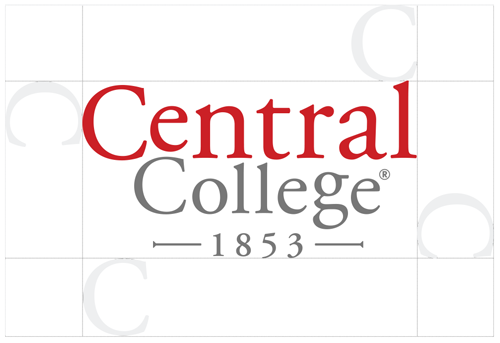
This logo was created to work on a large variety of applications. Size it appropriate to each specific use. The logo should have a balanced presence on the page in comparison to the other graphic elements. When positioning it close to other elements, make sure to give the logo spacing to maintain readability and integrity.
Use the C in Central as a guide for the minimum spacing, on all sides. This spacing applies to all formats of the logo.
Unacceptable Logo Usage

Do NOT distort the proportion of the logo.

Do NOT change the size relationship of the different elements

Do NOT apply effects to the logo.

Do NOT change colors of the logo.

Do NOT create your own version of the department name unit.

Reversed logo may ONLY be placed over PMS 186, PMS Cool Grey 11, Black or a photo.
Central College seal
Central College has an official seal. It will only be used on official college documents such as transcripts and diplomas.
It is NOT to be used without the permission of the Central Communications Office.

Download the logo:
EPS Versions for Print Use:
PNG Versions for Print Use:
JPG Versions for Print Use:
EPS Versions for Display on Screens/Web:
PNG Versions for Display on Screens/Web:
JPG Versions for Display on Screens/Web:
Colors
Our school colors truly signify the boldness of the Central mission — to go out into the world and always strive for the best. Additionally, they signify both the support you will receive at Central and the personal confidence that will result.
Use these colors consistently to maintain the brand.
Print Colors
c0 m100 y80 k5
c63 m52 y44 k33
c44 m34 y29 k10
Web/Digital Colors
Because digital displays use a different method to create color, we use slightly different colors for digital use. These colors are to be used for anything that will be displayed digitally.
#CB2026
rgb(203,32,38)
#990000
rgb(153,0,0)
#660000
rgb(102,0,0)
#CCCCCC
rgb(204,204,204)
#666666
rgb(102,102,102)
#333333
rgb(51,51,51)
Typography
Nobel Book, Nobel Regular and Nobel Bold are the primary fonts used. Nobel Book is used for large amounts of text or body copy. Nobel Regular is used for subheads, body copy in white text or highlighting a word or phrase. Nobel Bold is used for all headlines and titles.
All three versions of Nobel must be purchased for use.
Nobel Book
abcdefghijklm
nopqrstuvwxyz
ABCDEFGHIJKLM
NOPQRSTUVWXYZ
1234567890
Nobel Bold
abcdefghijklm
nopqrstuvwxyz
ABCDEFGHIJKLM
NOPQRSTUVWXYZ
1234567890
Nobel Regular
abcdefghijklm
nopqrstuvwxyz
ABCDEFGHIJKLM
NOPQRSTUVWXYZ
1234567890
Alternate Font: Arial
abcdefghijklm
nopqrstuvwxyz
ABCDEFGHIJKLM
NOPQRSTUVWXYZ
1234567890
Typography: General Usage
Headline and body copy usage: Font size can vary per situation, but always make sure the headline is a minimum of twice the body copy font size.
Red 186 CP can be used in the headline, subhead or as needed to call attention. Cool Gray 8 CP or Cool Gray 11 CP can be used in very large headlines, body copy and call outs. Black can be used on any of the type applications.
used on any of the type applications.
Headline
Nobel – Bold
Kerning should always be set to 40
Subhead
Nobel – Bold
Kerning should always be set to 40
Body Copy
Nobel – Regular
Kerning should always be set to 0
Body Copy
Nobel – Book
Kerning should always be set to 0
Body Copy
Nobel – Light
Kerning should always be set to 0
Website
References to www.central.edu or central.edu/ websites should always be bolded and red.
Use “www.” only when referring to the main homepage.
Omit when referring to any subpage, such as central.edu/apply.
